Ludico
Designing an app to centralize kids' events while ensuring maximum flexibility for parents
Ludico is a recreational events app for children in the city of Rome that centralizes available events, solving the problem of confusing searches on the web and cumbersome booking processes.
The process has included:
Research on parenting psychology
Research on children's events and playrooms in Rome (Italy)
Competitive analysis of platforms offering children's entertainment and daycare services
OVERVIEW
Product Designer, UX Researcher
ROLE
Figma, Notion, Dovetail, Perplexity
TOOLS
TIMELINE
1 month
B2C
Family & Parenting
INDUSTRY
The Problem
In the city of Rome (Italy), parents face challenges in finding and booking suitable play spaces, events, and creative activities for their children due to the absence of a centralized digital platform.
The lack of a unified resource leads to difficulties in discovering available options, managing bookings, and ensuring safety and flexibility.
01
Research
Research Summary
In approaching the research, I began by identifying competitors that offer entertainment services for children. In doing so, I analyzed three different digital platforms, one of which is based specifically in the Roman territory, and two others that allowed me to identify unique value propositions, advantages, and disadvantages.
So I proceeded by
Analyze the level of flexibility these platforms offered
Analyze their business models
Identify similarities, differences, learnings, and opportunities
From this analysis, it emerged that each platform, whether it was a B2C or a B2B, relied on partnerships with local businesses to offer a wide range of activities and services.
So my key learnings included building strong local relationships, focusing on seamless booking with real-time availability, fostering community engagement, and implementing flexible pricing and safety protocols.
Based on this preliminary research, I had to determine, given the project's limitations, whether to focus on designing a product that primarily addressed the challenge parents face in finding entertainment activities for their children, or to create a product with the primary goal of connecting and bringing together various organizations and entities offering children's entertainment services on a single digital platform.
Ideally, I wanted to proceed by designing both aspects of the product, starting with bringing the organizations into a single digital space. However, since I had the opportunity to interview mostly parents, I chose to further develop the B2C side of the product.
After conducting interviews with parent individuals based in Rome, I identified these key findings:
📍 Parents have difficulty finding children's events in the Roman area; they often discover them through word of mouth or scattered internet searches, but there is no single space where these events are listed and shared. Additionally, when it comes to booking, they usually do so by calling or emailing.
🎨 There are certain activities that parents prefer for their children, including music and outdoor activities. In general, they want their children to socialize and do things that they would not normally do at home.
👷 Safety is a fundamental issue; parents want to see photos of the places where they will take their children and know how many educators will be managing the event.
🔒 Regarding privacy and entering data on a digital platform, parents are not afraid to list practical info such as allergies or any medications their child takes, but they do not want to share too much about the personality.
👥 Parents highly value the parent community and they trust each other.
This data allowed me to carefully work on a affinity mapping and gave me insight into the types of users that would be using this feature.
02
Define
After collecting and organizing the data from my research, I asked myself three fundamental questions:
💻 How might we create an app that centralizes children's events in Rome and allows for a smooth and flexible booking process for parents?
🤝 What kind of services should children's event organizers offer on our app? How can the app facilitate interaction between organizations and parents?
🧑🤝🧑 How can we help parents feel connected to a community of other parents on the app?
Based on these three questions, I was able to define the project goals in more detail.
03
Ideate
In the ideation phase of the project, I outlined what the key features of my app should be and divided them into must-have, nice to have, and surprising.
04
Design
Information Architecture
Once I identified the key features of my app, I worked on the sitemap to define the structure, labeling, and navigation of the app's elements.
Interaction Design
After defining the structure of the app, I began working on the task and user flows to illustrate how the key features would be integrated and how would they ensure flexibility for parents.
Task Flows
User Flows
Branding
For the app's branding, I chose “Ludico”, an Italian word meaning playful, derived from the Latin “ludus” (game). As for the logo, I wanted to design a stylized face that didn't suggest any specific gender, but simply conveyed a sense of enjoyable activity, combining relaxation with fun.
As for the typography, I chose Fredoka for its playful character and Nunito Sans for the body text to add a touch of sobriety.
As for the colors, I wanted to use pastel shades without losing sight of accessibility, and I aimed to associate them with specific playful activities, as you can see in the cards I designed.
Wireframes
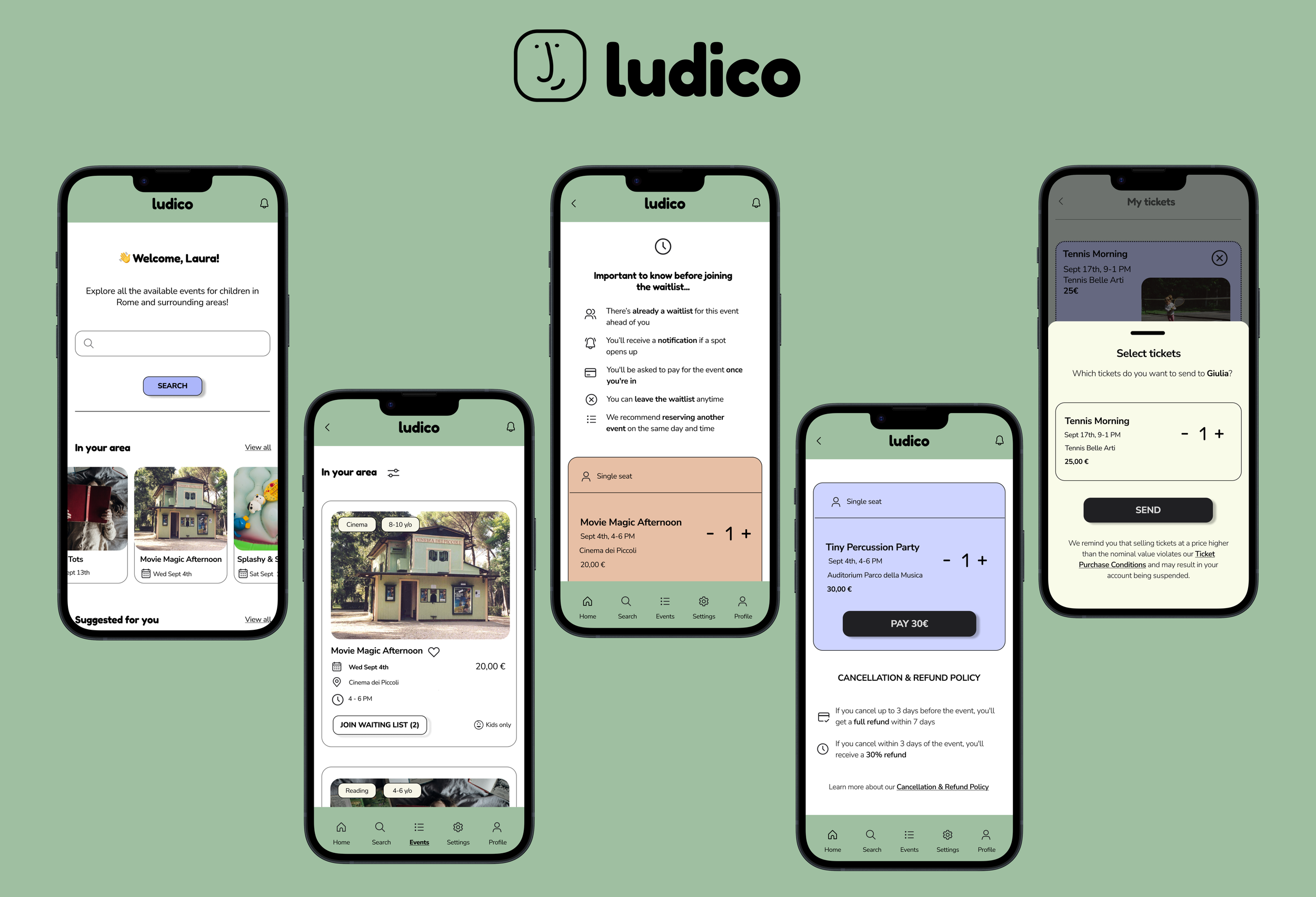
Having a clear understanding of the ludico’s features, I started designing the wireframes of how these features would be implemented, beginning to get a clearer idea of how to manage the elements on the screen.
LO-FI WIREFRAMES
The mid-fidelity wireframes helped me clarify the information architecture and understand how to manage it in relation to the different flows that I chose to develop.
MID FIDELITY WIREFRAMES
The high-fidelity wireframes have finally provided greater refinement and could finally be presented to the users and I could iterate on them.
HIGH FIDELITY WIREFRAMES
Scenario 1 . A parent wants to book event A but it’s full, so they join the waiting list and secure another spot in event B
Join the Waiting list
Tap on “Tiny Percussion Party”
Tap on “Reserve”
Tap on “Pay 30€”
Tap on “Buy”
Ticket purchased
Scenario 2. Spot in event A becomes available, the parent is notified, signs up and leaves spot in event B.
Tap on “Yes, cancel reservation”
Tap on “Book new event”
Tap on “Pay 20€”
Tap on “Buy”
Choose “Giulia”
Tap on “Send”
View all events in your area
Log in
Tap on “Join Waiting list”
Tap on “Movie Magic Afternoon”
Tap on the first notifications
Tap on “Notifications”
Tap on “Cancel and book new event”
Tap on “Reserve”
Ticket purchased
Scenario 3. A parent bought two tickets for an event and wants to send one to a parent friend.
Tap on “Profile”
Tap on “My tickets”
Tap on “Send to a friend”
Tap on “Tennis Morning”
Ticket sent
05
Test
After testing my product with the users I was able to gather some interesting feedback:
Managing conflicting event bookings
When booking a newly available spot in an event for which users were waitlisted, some users found it challenging to manage if they had another event scheduled at the same time. They might not want to cancel the existing event, especially if they have multiple children attending different events. Although the design allowed users to keep their current ticket, the user interface and ux writing did not make this option clear enough.
Before
After
Regarding the option to send tickets to a friend, there was uncertainty about the wording “send to a friend” because users were concerned that they wouldn’t be able to choose the number of tickets to send and might end up sending all of their tickets. Therefore, I changed the wording to “send a ticket to a friend” to provide more assurance that users are always in control of managing their tickets.
Clarification of ticket sending options
Before
After
Final Design
Conclusions
➡️ What didn't go as planned and why?
While working on this project, I suffered the constraints in terms of time and resources available to me. I feel that I would have liked to analyze more the challenge of bringing event organizers onto a single digital platform in order to better tackle the parents’ challenge of actually finding these events and booking them with flexibility.
➡️ What could have I done better?
During the feedback phase before iterations, I realized that in managing certain aspects, like joining the waiting list and canceling an event when two occur on the same day at the same time, I was unintentionally influenced by my experience as an only child. Many parents who tested the prototype noted they would have preferred more clarity in situations with two or more children, where they might want to attend different events on the same day at the same time.
➡️ What did I learn?
This project was crucial in my growth as a Product Designer, UX Researcher, and UX Writer. I had the opportunity to reflect on the different identification of challenges related to different groups of people with different needs. I worked hard to provide UX Writing that was aligned with the brand's tone and, above all, was inclusive, welcoming, playful, and reassuring. I always made sure to test my design frequently to iterate on it while I was working on it.


